With no real expert basis for choosing a spacing style, it's my opinion that this is after all just a matter of fashion, like the length of the skirt or wearing white after labor day. Some of the more quoted sources on the one-space rule include style guides, such as the Chicago Manual of Style. The word "style" should be a clue here. It's only a rule if you work for the University of Chicago Press. And their goal is to present a consistent style for all their published works. Another publisher certainly might choose differently.
The Point
So if there's no clear set of studies, no foundation for this allegedly expert conclusion on spacing, then why has the industry shifted so strongly towards word spacing for sentences? Why don't other publishers choose differently? The hint is the the word I just used, "industry", and while there are several factors at work, the most important answer I believe is the age-old answer to many questions we ask.
Money.
In our case the money manifests itself in terms of time and energy and general human laziness. Human costs. There are a few issues related to spaces and money. But the biggest one by far is brought about by the ambiguity of the period. Periods are not used only at the end of sentences—they are decimal points, and are used in abbreviations. So we can not blindly put two spaces after every period. We only want them at the ends of sentences. One might suggest that a sentence is a period followed by a capital, but someone like P.T. Barnum might beg to differ.
Typesetting Technology
From the time that movable type was invented all the way up to the end of the 19th century the printed page was created by laying out block letters one letter at a time by hand in the desired layout. This was the practice for more than 400 years. And in this time, extra spacing dominated. The professional typesetter was hardly bothered by the ambiguity of the period. Typesetting was slow work, and the typesetter was certainly aware of the flow of meaning and context in what he was typesetting. Adding additional space between sentences was hardly an extra burden.
But eventually, printing moved from a craft to an industry. With the introduction at the end of the the 19th century of hot metal typesetting, a keyboard could be used to set the type. At the same time the principles of the assembly line changed the way the world worked. The demands of modern business required progressively faster production. If a newspaper (or a book or magazine publisher) was trying to get out text as quickly as possible for the least cost, they needed to streamline the typesetting process. In this context, one space was better, because the typesetter didn't have to think about what the period meant. They didn't even have to read for context, they could simply copy the literal text into the typesetting machine. And a one-space rule left no opportunity to "mess up". The idea of visual appeal would never need to come into play in this decision. Using word spacing between sentences was already something that existed, and while not being the most popular at that time, it was also not considered wrong. Changing your style guide to word spacing would reduce errors, increase production, and reduce cost. There was no downside for a publishing company to move to word spacing, except an arguable loss of aesthetic appeal.
Once you accept this, you can see the futility in following style guides which were produced by the industry for use within the industry. Even submission guidelines which mostly favor word spacing are going to be linked to simplifying the work of the editor and publisher.
The World Wide Web
That's my hypothesis on the lost space, based on reading what lots of other people have had to say on the subject. I haven't seen direct evidence that actually shows that this is what happened. But it is a more sensible hypothesis than anything else that's been offered to this point. And I can move forward a bit into an area of my own expertise. I was one of the participants in the emerging World Wide Web standard in the early 1990s.
The Web uses HTML as its standard data format. All the versions of HTML up to (but not including) HTML5 are based on SGML (Standard Generalized Markup Language). The goal of SGML, its entire reason for existence, is to separate the content of text from the meta-information (in this case, layout information). SGML puts meta information inside "tags" which are blocks of text inside of angle brackets (e.g. <TAG>) The part that appears between the tags is content. Content doesn't care how much space there is between sentences, that's layout. So SGML naturally always collapses multiple spaces into a single space. After all, a space's only purpose is to separate words and other things from each other, and one space does that as well as twenty spaces. The only thing that more spaces can do would be layout, and that does not belong anywhere except in a tag.
So the space collapsing behaviour of the web comes from this, not from anything at all related to the aesthetics of the spacing. The goal of HTML at that time was to be a small simple language used to retrieve other document types via hypertext. No tag to mark sentences was ever introduced into HTML. I can't even find any record that such a tag was ever proposed. There was a discussion in 1993 on how to render spaces after periods, and the conclusion was that a single space made the most sense. Again, this had nothing to do with typesetting or readability or aesthetics, it was all about expediency:
I personally would prefer "one space fits all" as writers of HTML really shouldn't need to know the fineries of typography (What's next? Range kerning?), especially since it's not something 99.99% of people will notice (i.e. it won't even look "wrong").
And:
So in the case of the web, we can be sure that the reasons for using a single space are technical, and not typographic or otherwise aesthetic. And also not to conform to any particular standard. This is what lead me to conclude that this was the likely motivation of the industry well before computerized layout existed.
Typewriter habits
One benefit of my reasoning is that it finally makes sense out of the typewriter nonsense. This was an issue that initially drew me into this subject—the inconsistency of the typewriter arguments that are offered. Many "monospacers" claim that two spaces on typewriters made sense because the letters are not proportional, and so you need the extra width "to even things out" or something like that.
This makes absolutely no sense. Essentially, the argument would be that typewritters with their oversized spaces (and oversized periods too) need to have even more space added between sentences, while proportional fonts which use little tiny spaces that are smaller than almost every letter do not need two spaces. This never made sense. It just became something that people would repeat simply because it had a familiar and comforting ring to it.
However, in light of the argument I'm making here, typewriters finally make sense. The typist, like the typesetter, isn't simply mass-producing text. Unlike the factory worker or the computer program, they will naturally pay attention to the context. And in paying attention to the context, they can choose to add additional space between sentences.
Another thing that may be at work in the two-spaces typewriter rule is that it largely came from teachers. Even if we don't agree that it improves readability, perhaps teachers found that it improves "gradeability"—papers were easier to grade if sentences were clearly set off from each other.
This practice has also had some interesting interactions with modern user interface design. Most word processors allow you to add extra space between sentences if desired. And modern software is smarter, and not so easily fooled by abbreviations. However our training in typing two spaces has had some interesting implications. Many word processors ignore the extra space you type. Some let you add space, but only if you keep trying to show that you mean it. And some software depends on waiting for two spaces as an aid to clarifying when you've reached the end of the sentence, sometimes going so far as adding a period if you type two spaces without one. This wide array of behaviour is most certainly another thing that influences submission guidelines, and their desire for consistent spacing in submissions. Again, we see the most likely explanation has nothing to do with aesthetics and readability, and everything to do with technology and convenience.
Terminology
On my last revision of this document, I used the phrases "French spacing" and "English spacing" to refer to word spacing and extra spacing respectively. I realize now this has introduced some confusion. Some people only use "English spacing" to refer to the modern typewriter practice of using two spaces between sentences, and indeed it seems that this meaning may be accurate in terms of its historic usage. Furthermore, "French spacing" is not simply used to mean that one (word) space is used between sentences, but sometimes that (ironically) an extra space is also used before the punctionation, as at the end of this sentence ! I now belive that this very detail has contributed to the confusion: if the phrase "English spacing" was applied only to typewriter habits, then indeed "English spacing" was a new thing introduced along with the typewriter. I think some people would then interpret this to mean that extra spacing was also a new thing, although this is clearly not the case.
This underscores something else that is also true: using "two spaces" was definitely new with the invention of the typewriter. But this is of course because it would never have made since to count spaces before this—you'd just measure the space. I think this has contritubed to the typewriter receiving the blame for the use of extra space, when in reality it was just responsible for changing the way we talk about "space" versus "spaces".
Conclusion
So where does this leave us? Hopefully we can all just relax. If your boss or teacher demands two spaces then you can type two spaces without getting bent out of shape. If your publisher demands one space you can also please them with no loss of honor. And if you are writing for yourself, then you are free to follow your own aesthetic sensibility. You do not have to be oppressed by the conformists any more, no matter which side they are on. As for myself, I favor the more handcrafted look of extra space over the mechanized look of word spacing. But most of the time (for the web at least) I probably won't bother.
Do what looks right.
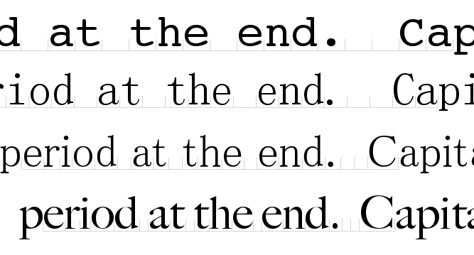
Addendum, Aug 2011. I've reformatted this web page to give you some control over the spacing between sentences. By default, it loads with roughly two spaces between sentences—one real space, and an extra 1/4 em (the part you can change). While there is no strict standard, one space is often about 1/4 em. An em is a unit of measure where the height of the font is always one em (at least this is a modern standard, the original meaning of an em is the width of the capital letter "M"). A typical web font might be 16 pixels high so one em equals 16 pixels, and if a space were 1/4 em it would be 4 pixels wide. The following table lets you add extra spacing (just click on a box), and shows you what the total spacing is with the very improper assumption that the spaces you are already seeing are 1/4 em. Note that back when typesetting was done by hand, typical spacing between sentences was 1/3 to 1/2 em, although sometimes even a full em or more was used (and sometimes word spacing was used).
| +0 ≈ 1/4em (1 space) |
+1/12 em ≈ 1/3 em |
+1/8 em ≈ 3/8 em (1½ spaces) |
+1/4 em ≈ 1/2 em (2 spaces) |
+1/2 em ≈ 3/4 em (3 spaces) |
+3/4 em ≈ 1 em (4 spaces) |
+1px | +2px | +3px | +4px | +5px | +6px | +7px | +8px |
At smaller font sizes some of these spacings may
not appear to be different.
Also, I could
have given you fuller control by removing spaces between sentences
entirely, however that would harm the content since (for example) a
cut-and-paste of text would have no space character at all where there
should be at least one.
Some Links
A few of other articles in support of additional sentence spacing:
Reader Comments (Moderated, may be delays. Posts may be edited or ignored. I reserve the right to remove any or all comments, at any time.)
13 comments:
|
At 2011/08/12 8:14 wrote:
|
As a workplace-ostracized "double-spacer" I found the following piece very satisfying...
http://www.manifestdensity.net/2011/01/14/everyone-has-a-right-to-their-beliefs/
[The] argument about [the] beauty [of the single space], like all such arguments, is easy enough to dismiss: I disagree. I find it easier to read paragraphs that are composed of sentences separated by two spaces. Perhaps this is because I, like most technologists, spend most of my time working with (quite lovely!) fixed-width fonts for practical reasons. But there’s also a deeper beauty to the two space rule — a sort of mathematical beauty. Let me explain.
Consider the typical structure of writing. Letters are assembled into words, which turn into phrases, which are arranged into sentences — at the same time being assigned to speakers, a neat trick — which are then combined into paragraphs.
It’s a chemical process, a perfect and infinitely flexible hierarchical system that should command our admiration. Being able to rationally examine, disassemble and interrogate the final product is a mark of the system’s beauty. Anything less is settling for a sort of holistic mysticism.
It’s disrespectful to let writing’s constituent elements bleed into one another through imprecise demarcations. If you see me “making mistakes with comma placement”, please rest assured that I’m doing it deliberately. In most cases the comma doesn’t belong to the phrase delimited by the quotation marks that enclose it. Placing an exclamation point or question mark to the left or right of a close-quote is a weighty decision! That we violate the atomic purity of quotations with injected commas is an outrage.
And though I don’t get quite as worked up about it, the same sort of thinking motivates my belief in the double space. Sentences deserve to be clearly delineated, but because of the complications of quotation, ellipses, interrogatives and exclamations (among others), there is no reliable punctuation that can be counted on as a terminator for sentences. Single spaces are already spoken for: they separate words. The double space is an elegant and subtle solution.
|
|
At 2011/08/12 8:48
|
Thanks. Being a programmer, I use logical placement of quotes and commas, not traditional. Of course, the comma before quotes thing is also a typesetting thing. Visually it is more appealing and consistent if the comma is tight against the phrase. With quotes first, the comma or period seems to hang in the middle of nowhere. But of course when I write stuff, I'm not typesetting, which is why I still do that. From a visual (typesetting) point of view in my opinion the comma would be directly below the closed quotes. With that in mind I've sometimes wondered if typesetters had a combined sort (block) that had both the comma and closing quotes on it - combined sorts were very commonly made for tighter kerning, and certain letter pairs (like "fi") were usually combined into a single sort. tom
|
|
At 2011/12/17 17:31 mscottveach wrote:
|
I think you make one kind of glaring mistake in this otherwise incredibly precise article...
...you say that you've never understood that argument that "typewriters require a double-spacing after a period" because look at how HUGE the space is on a typerwriter! And if the point of double-spacing was to create a larger gap then we obviously should need it in proportional fonts because the gap is smaller there.
But you've forgotten the key element: the size of the space after the period just needs to be larger than the distance between the center point of each letter... it's not absolute, it's relative to the spacing of the letters.
So proportional fonts have a shorter space but they have a MUCH shorter distance between letters. So, while the space is smaller than courier it is still designed to be the right size to separate sentences. It is is still larger relative to it's letter-spacing than courier is relative to it's letter space.
Make sense?
|
|
At 2011/12/19 10:50
|
Sorry, no it doesn't make any sense. With a fixed width font, the space between the center point of all the letters is the same. And the space character (used between words) is also the same. But in a proportional font, this distance changes, depending on which letters we're talking about. In general, it's smaller of course, and sometimes it's much smaller. But the space in most proportional fonts is usually similar to the width of the letter "i" (no hard and fast rule, just a general observation. So let's say we are comparing a fixed width font with characters that are 10 units wide, to a proportional font with characters that are on average 7 units wide. The space character might just be 4 units wide. So this is exactly my point here. The space has already been scaled down. But in the vast majority of cases, it's been scaled down more than just to the average spacing. If proportional fonts did use an average width for their spaces (7 units in this example), that might (in my opinion) be an argument for using the same spacing rule for both fixed and proportional fonts. But in practice proportional font spaces are even smaller than that. And I haven't touched on the period at all. Most proportional fonts use extremely narrow periods, for a nice aesthetic of the period next to another character. Fixed width fonts of course have a small little dot in a big empty space. There's no way to fill the space out, as with the letter "i" which typically is given very large sarifs to visually fill its width. So on a typewriter, you naturally have more visual space between sentences even with only one space, because that tiny period is providing a bunch of visual separation too. Yet another reason why this typewriter rule is backwards. tom
|
|
At 2011/12/19 11:32 mscottveach wrote:
|
Well, despite the fact that you have examined this more closely than I have, I am still fairly certain that I am on the right path, so let me try again...
...my point is that there is a metric you're ignoring in your comparisons. For example, you talk about fixed-width fonts having characters that are 10 units wide and proportional fonts having characters that are on average 7 units wide.
Then you compare that to the "spacebar character" which is 10 units wide in the first case and let's say 4 units wide in the second case.
My point is that you still don't have the measurement that is most important in determining whether or not your "spacebar character" is wide enough.
I'm arguing that you need to measure something else, let's call it "cramping score," of a font - which would measure the ratio of "ink to white space" in any given character. (So, for example in a fixed-width font an M would always be more "cramped" than an i.)
I'm arguing that Courier has a very low cramping score compared to Times New Roman. Another way of saying that is that there is a lot more "white space relative to blank ink" in any given character.
And I'm also arguing that this "cramping score" is what really determines how much white space is needed between sentences to give the impression that they're separated enough.
So, it has nothing to do with the absolute width of the "character space" and it also doesn't have anything to do with the width of the "character space" compared to the width of other characters in the font.
But it does have to do with how "cramped" the font has been designed to be - if the font has been designed so that there is only enough room in each character to hold the actual letter marks then you can get away with a smaller "spacebar character" - but if the font has been designed so that the letter marks sit lonely in the middle of their allocated space, then you're going to need a much wider "spacebar character."
By the way, looking at a page of typewriter text side-by-side with say Times New Roman really illustrates this "cramping factor"; and I think helps make it clear how that affects the distance needed between sentences...
Does that explain my point better? Getting swayed at all yet?
|
|
At 2011/12/19 11:59
|
No, I'm still not swayed. Aesthetically, what you are talking about has just as much to do with how "heavy" a font is as it does with how tightly kerned the letters are. And the two are closely related. While a font might be very heavy but with loose kerning, or very light but with tight kerning, most of the time, lighter fonts have looser kerning. In my opinion, most typewriter fonts are designed to be a bit lighter to be consistent with the looser kerning. The "i" has to be made wider with exaggerated sarifs, but even with that there's still going to be some whitespace. It's a compromise. At any rate, I'll agree that with much tighter kerning, a much smaller space makes sense. However, if I trust the font designer to do their job, then the space in both cases will be close to "the right size", meaning big enough to provide clear word separation. But if we look at it from this point of view, then there's still no reason for a rule about more spaces on the typewriter. Especially in light of the additional argument I made about the extra white space provided by a period in a fixed-width font. And I'll revisit my argument here that the true difference is the hand-spaced process of typing versus the automated or assembly-line spacing process associated with both mass production, as well as many software applications. I still feel this is a much more likely explanation for the differing "rules". Also, we're focusing on a narrow point here about the typewriter rule. In the bigger picture, I see nothing here at all that would influence my argument that sentence spacing is an aesthetic choice, not a typographical mandate. tom
|
|
At 2011/12/19 19:40 mscottveach wrote:
|
Well, maybe I don't understand what you meant when you said:
"Many "monospacers" claim that two spaces on typewriters made sense because the letters are not proportional, and so you need the extra width 'to even things out' or something like that.
This makes absolutely no sense. Essentially, the argument would be that typewritters with their oversized spaces (and oversized periods too) need to have even more space added between sentences, while proportional fonts which use little tiny spaces that are smaller than almost every letter do not need two spaces. This never made sense."
The entirety of my point is to show how that does indeed make sense.
1. This is an aesthetic argument on all sides. Monospacers saying that you need "two spaces" for aesthetic reasons. You say it's an aesthetic issue. I agree. Right?
2. You agree that kerning and heaviness (I'm learning the terms as we go!) should be an influence in how wide the space needs to be (from an aesthetic point of view).
3. You say that if you trust the font designer to do his job than you shouldn't need two spaces. But that's exactly my point. The problem is that Kettler wasn't without constraint when he designed Courier. So the technical constraints of his design put him in a situation where he designed a font that most people think (aesthetically) requires two spaces.
4. This technical constraint is strongly associated with the technical limitations of the typewriter; hence, it being associated with typewriter fonts. Modern proportional fonts get around this issue as the designer can make the space the correct width.
3. So at the very least, I don't understand why you don't understand why monospacers use the argument that they need two spaces to even it out. If the font designer had been able to do his job, they wouldn't, but a typewriter provided special constraints.
So, if you agree with the above then you now have a very sensible, elegant and compelling reason why people double-tap on a typewriter and not when using TNR. It's an aesthetic reason in both cases... because one font was designed to look good with one tap (TNR) and the other had technical limitations that prevented that from being true (Courier).
To be honest, I was avoiding the other arguments you made because I have a couple nitpicks here and there and didn't want to muddle but I'll tackle them now...
...oh! As I reread your post, I see maybe where some of the confusion comes from... you make an argument as to why typesetters should want to French space (that way they don't have to disambiguate the period) and say this finally makes sense of why typists double-space...
...you throw away the real reason typists double-space (the prefer the aesthetics of it on courier - which by now we both agree is reasonable - see above) and then say that the actual reason typists double-space is because it's easy for them to disambiguate on the fly.
Huh? Why would they WANT to double-space though? You threw away the reason they offer and then held up the reason why typesetters don't double-space as the reason why typists do double-space? But as you say: typesetters French space because it's easier... that tells us nothing about why typists double-space... and certainly doesn't compete with the reason they offer.
What am I missing that line of logic?
There's something else I don't understand, and this is about you're overall point. What makes you think the "spacebar character" is a special character to the typesetter? Why do you think they're the ones responsible for whether to place one or two spaces between sentences? Is that really true? Isn't the number of spaces going to be dictated by the manuscript? The typesetter is like the human equivalent of hitting "print" - they're not rewriting the manuscript or checking for spelling errors, they are merely slavishly copying the manuscript character-for-character. If the manuscript has two spaces after a period, then the typesetter puts two spaces, if it doesn't then he doesn't.
It's hard for me to imagine that the decision of how many spaces to typeset is the one area where they had free reign...? Of course, if they're just copying the manuscript character-for-character then everything you've said makes no sense... so I guess maybe you know for a fact that this was indeed the job of the typesetters through the beginning of the 19th century... is that true?
|
|
At 2011/12/19 20:09
|
Wow. I think I see the problem. And I think it all has to do with the difference between space as an arbitrary distance between words or sentences, and spaces as a countable fixed unit. Let me answer your last question first. The important bit here is that the typesetter is not working from a digital file, he's working from a stack of hand-written pages, and he's turning it into a book. There was no such thing at this point as "one or two spaces". The question in that time wouldn't have even made any sense. There might have been a conversation with the typesetter about how much space (NOT how many) was preferred between sentences. Or the writer might just trust the typesetter to make their book look good. Regardless of who's choice it was, the printed record shows a preference for more space between sentences than between words, all the way up to the invention of the modern typesetting equipment. As for the typewriter convention. You are free to decide that aesthetically you feel that typewriter fonts need more space between sentences than between words, while proportional fonts do not need more space between sentences than between words. That's fine. What's not fine is saying that because of fixed-width fonts there is some kind of obvious requirement for more space between sentences. What I think happened is that when typewriters were invented, and you could no longer have arbitrary spacing, but instead had discrete countable spaces that were the same size as letters, people naturally used only one space between words, but to make their work look like professionally typeset work, they used two of these spaces between sentences to approximate the traditional look of more space. So in this sense, the use of "two spaces" was invented for the typewriter, but only because before the typewriter people didn't even count spaces this way. Or to rephrase, the new thing was NOT more space between sentences, but "counting spaces" instead of just "measuring space". And what I think happened is that people looked at this history, that two spaces became standard with the typewriter, and they link that with the idea that MORE space between sentences was invented along with the typewriter. And this is entirely factually wrong. But if you look at the Wikipedia pages on this subject right now, you'll see that they misstate things in exactly this way. tom
|
|
At 2011/12/19 20:45 mscottveach wrote:
|
btw, just to be clear, I actually don't have a horse in the aesthetics race and definitely agree that it's funny how intense people get about which way is right...
...but you do see how saying that "two spaces are needed to even things out" is exactly what you're saying is okay, right? It's an aesthetic argument... they're not saying it's "an obvious requirement" except in the sense that not wearing white after labor day is "an obvious requirement."
I was merely trying to point out that their statement isn't illogical in the way you suggest because it's not based on absolute width... it's based on the kerning and heaviness of the font. So you're comparisons between the width of the spaces kind of misses the point of their claim. I think I am just repeating myself there...?
I think you're exactly right about the idea that typewriters meant no longer having arbitrary spacing and so people had to use the spacebar character unit to approximate typesetting...
...and that we no longer have to do this to get that particular look because the font designer can once again have arbitrary spacing. Agreed.
|
|
At 2015/02/09 7:36 Edward Reid wrote:
|
The possessive form of "it" is "its", not "it's". This is used improperly four times. I mention this only because an otherwise interesting discussion is rendered a lot harder to take seriously by this gaffe. If the posting were on an unrelated topic, I would shrug my shoulders and move on.
|
|
At 2015/02/11 7:26
|
Oops. I know this rule well, but I still regularly blow it. I think I found the errors and corrected them. An unforgivable mistake, since this is not a topic on which there is (currently) any debate. I am curious though, whether sentence spacing or pronoun spellings normalized first. I'd guess that consistent sentence spacing is older than consistent pronoun spelling. Maybe I'll look it up if I have time.
|
|
At 2019/06/04 5:49 Olaf Bacon wrote:
|
On this document, discussing double-space-after-period, when printed on screen, the period is not.in.the.centre of the width of the position provided for a letter-character. The position of the period in the text, when not in equally-spaced fonts, as on a manual typewriter, is already printed kerned against the left side. Thus, the period is already closer to the end of the last letter of a sentence, when printed on screen. This automatically provides more space-width to the eye when it is followed by an empty gap of one "space"-width, before the new sentence begins. The eye also expects a new sentence to begin with a capital letter. Typewriter manufacturers could create replacement keys for typewriters that manually print on paper, so that the font for exclamation and comma and colon, and semicolon and period will be left aligned, and not centered. Then it will position the exclamation marks and comma and periods to the left side of the width of the typed character. However, when information seen on a page of paper does not come from a typewriter, but from a printer, and can be modified by PDF-modifying software, then the rules pertaining to the printer and rules used by the printing package which sends information to the laser printer, also needs be taken into account. With screen pixel sizes becoming closer and carrying more intelligence, double space characters after a period makes no sense. Perhaps the period followed by the double space was merely an antique rule imposed by the typists in the military at some time in a previous century, and these beaurocrats can be brought into the modern faster single-spaced universe and replace their manual typewriters with a word processor. One character missing on the typewriter is for a narrow space, such as 1/4 em, for placing after the period between initials and inside multiple letter abbrevations. Two references that discuss this https://hea-www.harvard.edu/~fine/Tech/html-sentences.html (updated April 2012), and https://stackoverflow.com/questions/595365/how-to-render-narrow-non-breaking-spaces-in-html-for-windows (Feb 27, 2019 with last comment Sep 25, 2016).
|
|
At 2019/06/04 13:42
|
In my own review of available fonts, most fonts center the period, and only a few provide extra right-padding as you describe. And there's a very good reason for this. The period is used for a variety of purposes, and only some of those purposes want that extra space. For example, a decimal point in number should be centered. And while pair kerning could handle this, the minority of fonts that use extra padding on the period do not correct this issue for numbers (or for Initials, or other uses).
|
| My Home | Professional Home | TomSaraZac Home | Work Email |